How Cognitive Load Kills Conversions and What Your Site Can Do About It
TL;DR
Cognitive load refers to the mental effort required for users to navigate your website. When visitors find your site confusing or complex, they abandon their carts. The average 5-step checkout process causes 22% cart abandonment – keep it to 3 steps instead.
To reduce cognitive load, use simple layouts, clear CTAs like “Buy Now,” limit product choices, write in plain language, minimize form fields, and optimize for mobile. Avoid unnecessary pop-ups and distractions.
Tools like Shiprocket Checkout help by offering one-page checkouts with 95% auto-filled addresses, which bring 25% more carts back to life and speed up transactions by 70%.
Introduction
Every second of your potential buyers counts when they visit your store. They often close the tab when they find it confusing or difficult to navigate.
In technical terms, this happens due to “cognitive load.” Simply put, it is all about the mental effort required for a user to process information on your website. The more they think, the harder it becomes to retain them on your site and complete a purchase.
For example, a lengthy checkout process on an eCommerce site can ultimately increase cognitive load and lead to cart abandonment. According to a study, the average checkout process on an eCommerce site spans 5.08 steps, which contributes to a high (22%) cart abandonment rate. Keeping your checkout in 3 simple steps is key to handling this business challenge effectively. Reducing this mental effort leads to improved conversion rates.
This blog is curated to help you fix cognitive load on your website. You will also discover how it impacts your sales.
Breaking Down Cognitive Load
According to Wikipedia, cognitive load is the effort being used in the working memory. In our case, if the website visitors are not able to find what they need or perform certain actions like purchasing a product or making payment.
The cognitive load is further divided into three types:
- Intrinsic Load
This load tells the complexity of the task itself. Let’s understand with an example:
For example, if you sell women’s western wear, choosing the right size from many options can be confusing – that’s intrinsic load.
- Extraneous Load
This type of load tells how you present the information.
For example, if your website has confusing layouts, too many options, or unnecessary steps in checkout.
- Germane Load
This is the effort users put into understanding the task and deciding what to do. It’s the “good” load that helps them complete their goal, if the site is supportive. As a seller, you may not be able to reduce intrinsic load (some products are just complex), but you can reduce extraneous load by making your website simple, clean, and easy to use.
However, you can reduce the extraneous load by designing your site in a way that is simple, predictable, and clear.
Pro Tip: Always ask yourself, ‘Will you follow these many steps to make this action?’ This mindset helps you spot friction points and improve the user journey.
If your buyer has to follow a 6-step process to order a product, they might give up halfway. Therefore, keeping your checkout process short reduces this mental strain and increases conversions.
Design Practices That Help Reduce Cognitive Load
One simple mantra for reducing cognitive load on your website is to make it easier to understand and use. In the era of 5G, everyone loves clarity and quick access to what they need.
Here are some practical design practices that help reduce mental stress and boost conversions:
Keep the Layout Simple and Predictable
Maintain a clean layout and incorporate plenty of white space on your website.
Also, include important elements like,
- Product filters
- Add-to-cart buttons
- Add checkout
Placing them where users expect to find them makes navigation easier. Keep your layout consistent. This gives users a sense of control.
Use Clear and Direct CTAs
We understand better when someone asks us to do something. A clear call to action (CTA) tells your users what they should do next.
When you write clear, direct and effective CTAs on your website, like “Buy Now”, “Continue to Checkout”, or “Add to Cart,” you encourage your visitor to take action.
Furthermore, please make sure CTA buttons are easily accessible and visually appealing with colour contrast or bold styling.
Limit Choices to Avoid Decision Fatigue
Avoid showing too many options. It can slow buyers.
It is better to display your top-selling or most relevant products by default, rather than showing 20 similar products or colour variants at once. This helps narrow down the focus and keeps the decision-making process smooth.
Use Simple, Familiar Language
Do not have too technical or complex words on your website. Not every user may understand those. Ensure to make it for all.
Let’s understand with an example:
Use “Choose Delivery Option” instead of “Fulfill Your Order Preferences.”
Write your website content as if you’re speaking to someone new to online shopping. This is especially helpful for users from Tier 2 and Tier 3 cities.
Reduce Form Fields and Use Autofill
Nobody likes typing their information repeatedly. It is recommended to reduce the number of form fields and utilise auto-fill as it causes form fatigue. You must only use essential fields, and wherever possible, apply autofill for returning users. You can also enable features like saved addresses. It helps users move faster.
Minimise Pop-Ups and Distractions
Unnecessary pop-ups, banners, or auto-play videos interrupt the user experience. This disturbs the user flow and increases extraneous load. However, you can easily use these features when needed, like cart reminders, offers or exit intent popups.
Better Visuals: Use Visual Cues and Icons
Icons help visitors identify the next steps they need to take, these are called micro interactions. For example, you can use icons for payment methods, delivery truck symbols for shipping info, or a shield for secure checkout. This supports authority and faster decision-making.
Optimise for Mobile
Most buyers today shop on their phones. If your mobile site is slow, cramped, or hard to navigate, your conversion rates will drop. In today’s era when most of the traffic is driven from mobile devices, it very crucial to have a website optimised for mobile conversions first.
Use large tap targets, fast-loading pages, and keep key actions within thumb reach.
Reducing Checkout Friction with Shiprocket Checkout
For an eCommerce seller, the checkout process plays an important role in ensuring that a product is purchased. This is because, even if your website is well-designed, a complicated checkout process can still hinder sales.
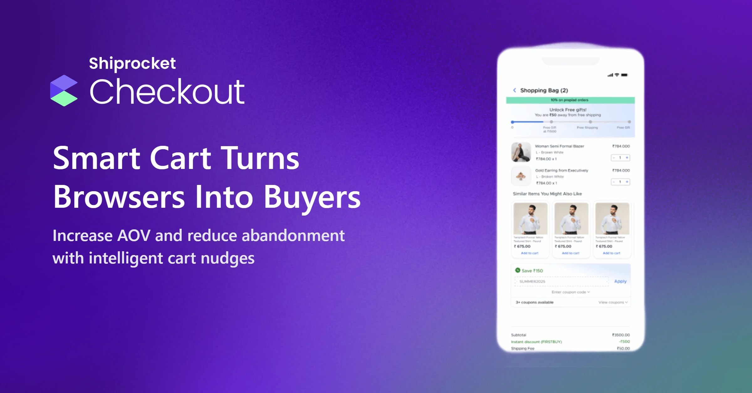
That’s where Shiprocket Checkout helps. We simplify the buying experience, particularly for D2C brands and online sellers. Shiprocket Checkout’s tech-powered solutions reduce cognitive load by offering a clean, one-page checkout interface. Buyers do not need to jump through multiple screens to complete their purchase.
Here are some more reasons why you should choose us:
Brings Carts Back to Life
We help to bring 25% more carts back to life with the help of:
- 95% auto-filled addresses
- Cart customisations
- Secured logins
- Display of estimated delivery date
Improved Performance
We help improve your site with:
- One-click solutions
- Fewer RTOs
- Payment-mode-specific discounts
- Parameter-based COD charges
- A/B testing and UTM Campaigns
- Consistent revenue growth
Effortless Checkout Experience to Increase Sales
With Shiprocket Checkout, you can enhance sales as we:
- Enable fewer drop-offs, more prepaid orders, and fewer COD orders.
Easy Integrations and Customisation
You do not need to integrate any code and can customise the UI as per your needs. Other benefits include:
- Personalised coupons and freebies
- Multiple payment modes are accessible
- Data security
- Advanced address filtering
In this rapidly evolving world, you need to move fast. This is exactly what our complete checkout solution does. It helps you speed up your transactions by 70%.
Conclusion
Reducing cognitive load is not just about design; it is about making your customer’s journey easier from start to finish. Small checkout process, clear layout, auto-fill shipping info, and many other things help you control this mental stress from your website, and users feel at ease.
Buyers will likely complete their purchase when your site is simple, focused, and predictable. Tools like Shiprocket Checkout simplify this process for you. It helps streamline the buyer’s path, remove unnecessary steps, and improve your conversion rate.


