How to Prevent Form Fatigue and Drive More Conversions with Better UX

Collecting shopper details, such as email addresses, contact numbers, and preferences, can be valuable for sending personalised offers and encouraging future purchases. To achieve this, many businesses request users to fill out detailed forms to continue browsing their website or during checkout. While it helps build a strong customer database for future reference, it can often drive away prospects. Lengthy and complex forms tend to annoy shoppers and interrupt the buying journey.
Statistics reveal that around 18% of shoppers abandon their carts due to complicated checkout processes, which mostly involve filling out lengthy forms. It appears like an added task and leads to form fatigue.
In this article, you will explore form fatigue and discuss ways to prevent it, enabling you to offer a better user experience.
Understanding What Form Fatigue Means
Form fatigue is the mental exhaustion shoppers feel when they are asked to fill out complex forms. Many businesses ask users to fill up such forms while they are browsing their website or making an online purchase. Businesses seek information to understand their customers better and contact them in the future to drive more sales. However, it is an unnecessary task for the users.
However, from the user’s perspective, this often feels like an unnecessary interruption, especially if they are browsing casually. Before your content or offers can capture their interest, the burden of form-filling may cause them to disengage.
Similarly, during the checkout process, lengthy forms often lead to cart abandonment. Thus, instead of helping businesses gather useful data, this activity often results in form fatigue and hinders sales. It is essential to prevent it to provide a seamless shopping experience.
Metrics and Signals That Reveal Form Fatigue
It is essential to understand the potential reasons for a low conversion rate. If you feel that form fatigue is a cause, then confirm it through session recordings, scroll maps, click maps, and user tests. Here’s how these metrics help:
- Form Abandonment Tracking – Certain analytics tools help to track the fields when a user starts filling out the form. This helps identify the areas where they are experiencing a drop-off in performance.
- Session Recordings – You can replay them to understand where shoppers often hesitate to move further or get stuck. This helps understand the cognitive overload your forms are causing.
- Rage Click Maps – These maps show repeated mouse clicks, highlighting areas where the user was unable to take action despite multiple attempts. These maps provide insight into the problematic areas, allowing you to simplify them for a better experience.
- Scroll Depth Thresholds – They provide insight into the sections beyond which users stop scrolling. They may stop engaging with the content or filling out the form.
Smart Design Tips to Prevent Form Fatigue
It is possible to prevent form fatigue by implementing a smart design and strategic approach. Here are a few tips to help overcome this problem:
Highlight the Purpose
Highlight the purpose of filling out the form so that users understand why they need to put in the effort. For instance, mention that they will be notified about sales and offers if they provide their details through the form. Likewise, signing up can unlock a special discount for first-time shoppers. Make it customer-centric so that it doesn’t appear like a burden, and they will fill it willingly.
Limit the Number of Fields
Long and complex form fields are a primary cause of form fatigue. Asking only necessary questions in simple language can lower the form abandonment rate. The user should be able to register for your portal by entering minimal information. The same should be the case during checkout.
Enable Autofill and Predictive Text
To lower cognitive stress, highlight recommended choices or autofill the form wherever possible. Predictive text also reduces effort and quickens the process.
Group Related Fields
You can make it easier to fill out the form by grouping related fields. Users can fill in the fields more quickly when related fields are clubbed together.
Use Simple and Familiar Form Designs
It is suggested to choose a conventional form design that your shoppers may have seen or even filled out earlier. This reduces the cognitive effort needed to understand the form and thus lowers the chances of exhaustion. When they already know what to fill in out and how to proceed, it doesn’t seem like a burden. Familiar form designs often have a higher completion rate compared to fancy and unconventional designs.
Minimise Errors with Clear Inputs
Your form should include clear labels and smart defaults to lower the possibility of errors that often lead to form abandonment. It is a good idea to use real-time validation to correct any mistakes instantly and keep the process moving forward.
Offer Real-time Feedback
You should offer actionable responses to guide users as they fill out the form. This can further reduce the chances of error and expedite the process.
Reinforce Progress Visually
As the users fill the form, top brands reinforce their progress to encourage them to complete it. This can be done by showing a progress bar or numbered steps. Phrases such as “almost there” or “just two steps to go” also serve the purpose. It gives a sense of achievement, so they continue to move forward.
Optimise for All Devices
The form should be readable and easy to complete across various devices. This increases the possibility of users completing the form without frustration. You can achieve this by using responsive design and simple layouts.
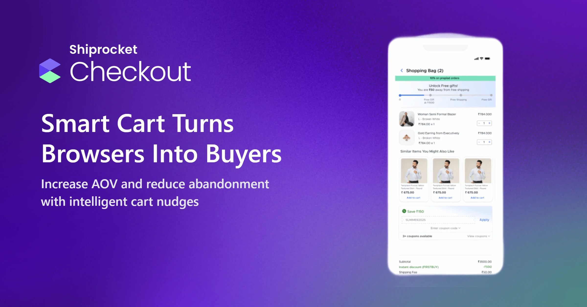
How Shiprocket Checkout Simplifies Forms to Boost Conversion Rates?
Shiprocket Checkout offers a one-click checkout process. Unlike conventional systems that require shoppers to complete lengthy, multi-step forms, Shiprocket Checkout streamlines the experience by providing 95% autofilled addresses. This enables faster checkout and reduces the scope for error, leading to a lower cart abandonment rate.
By adopting our user-friendly checkout process, you can increase your conversion rates by up to 70%. Moreover, we help increase prepaid conversions and lower the RTO rate by 30%.
To make adoption easier, Shiprocket Checkout offers a DIY, no-code integration. We offer secure and hassle-free logins to build customer trust in your brand. Our customer service executives are ready to assist with the checkout process and address any queries your customers may have throughout their purchasing journey.
Moreover, we provide insightful data analytics on shopper checkout patterns. You can use this to identify friction points and enhance user experience.
Conclusion
Form fatigue can drain a shopper’s energy and reduce their willingness to continue browsing or complete the checkout process. It results in cognitive overload. Your prospects should fill out various fields on the form to help us get to know them better. However, they often perceive it as a burden and leave your portal to avoid the exhaustion it causes. The aforementioned tips can prevent form fatigue and encourage your customers to fill up all the required fields. Businesses that have implemented these best practices, along with tools like Shiprocket Checkout, have improved conversion rates. By enhancing the overall user experience, you can turn a common friction point into a competitive advantage.